The visual part is usually the first thing that people notice about a brand. When something looks good and grabs our attention, we stop and take a closer look.
There are countless products and brands accessible for consumers on the market today, which makes the competition between brands more complex than ever before.
Brands are competing for attention in both the physical and the digital world, and the visual identity of a brand plays an important role in both cases.
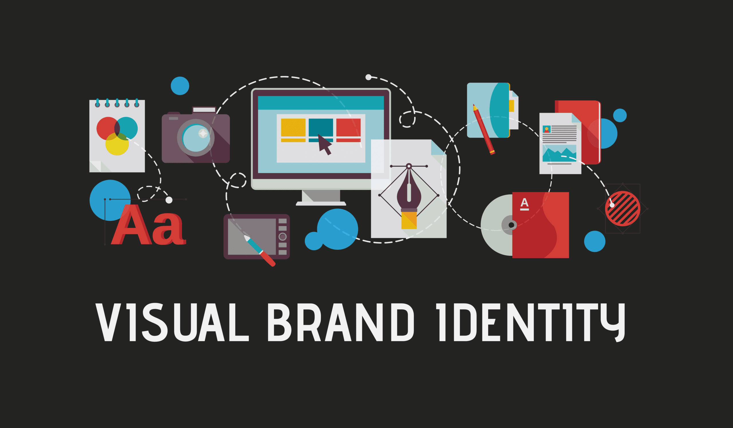
What is the visual identity of a brand?
The visual identity is a combination of visual elements used to express the purpose, mission, and value of a brand to its consumers. That usually includes brand colors, a logo, fonts, visual language, and content display.
We all interact with brands daily, so the visual identity of a brand is not be a hard topic for anyone to understand. However, not every brand has equal quality and presentation.
The Goals of a Visual Identity
Since it is the first thing that people get in contact with, here are a few things that a well-designed visual identity should successfully get across to potential consumers:
- Visually communicates the brand purpose and values
- Makes the brand stand out with a unique style
- Makes the brand easily recognizable
- It’s well set-up and pleasing to the eye
- It’s consistent across all products and channels
The most successful brands offer high-quality products and services to begin with, and the visuals and packaging are an additional feature that increases the value even more.
That means, in the grand scheme of things, all branding elements need to work well together. Before you start working on the visual identity of your brand, make sure that you have a strong driving force behind it, with a purpose, a mission, and a vision for the brand.
All the Social Media Graphics you need and many other design elements, are available for a monthly subscription by subscribing to Envato Elements.
There is no need to create every single thing from scratch. You can get the stuff you need and make them your own. Save time and energy on creating content.
The subscription gives you unlimited downloads from a massive and growing library of 1,500,000+ Social Media Graphics & Design Assets that can be downloaded as often as you need (stock photos too)!
This is an affiliate partner offer. If you like the products and choose to subscribe through our links we will get a small compensation in return, at no extra cost for you. These type of offers keep the website online and help us create more content about branding. Thank you for your support!
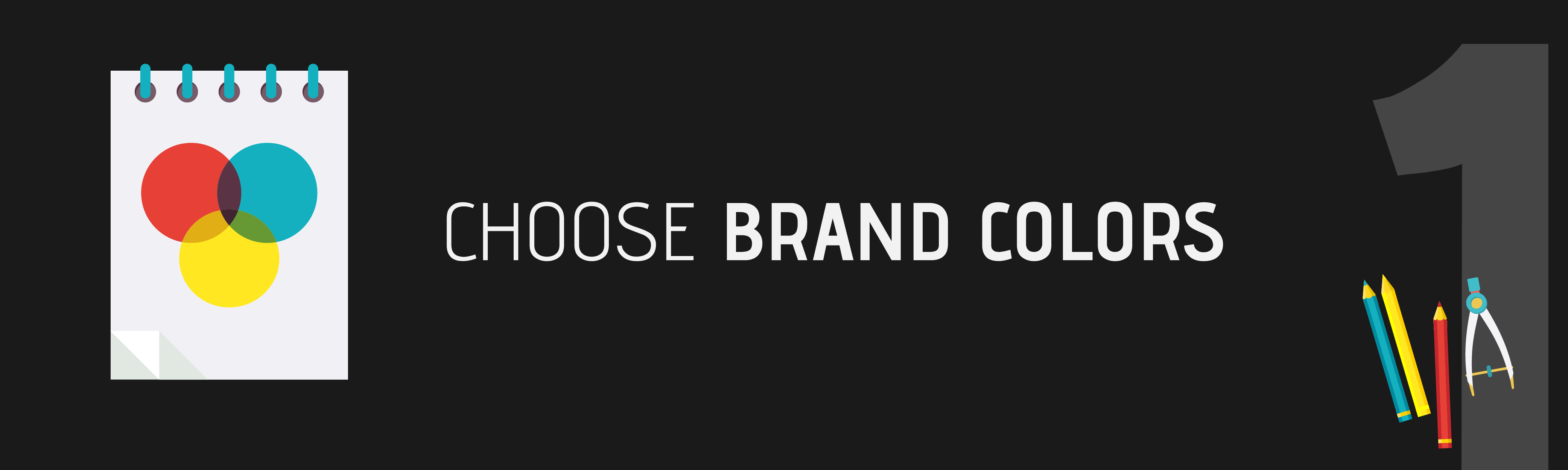
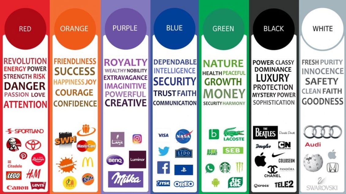
1.Brand Colors
Let’s start by talking about the colors of your brand because it can easily set the mood right from the start. When we see a color, our brain automatically attaches a specific meaning to it.
For example, you are probably familiar with the use of green color to confirm, or red color to cancel action in most user interfaces.
Red can also be used to deliver a warning or a mistake, so when you see it, your brain goes in alert mode, signaling you to be cautious. Text with green color usually delivers good news.
In another setting, the colors red and blue used together can often indicate hot vs. cold. Showering at a friend’s place is already complicated enough, can you imagine no color indicators on the shower?
Here are a few common uses of colors across different industries.
Color Harmonies
Different combinations of colors come together to deliver a more complex and aesthetically pleasing presentation of the brand. Color harmonies are a design tool that helps you pick a set of colors according to the color wheel.
You can read more about choosing combining colors in this color harmony guide.
Brand Colors Example: Coca-Cola has an easily recognizable color scheme across all its digital channels.

Start by choosing the right colors and harmonies to represent your brand and the feeling that you want to inspire in people that will be using your products or services.
2.The Logo
Moving on to the logo of your brand, I often see it as an equivalent to a profile picture. A good logo should be representative of the brand and always recognizable by the consumer.
It is important to have a logo that fits in the modern world and the industry that the brand is in, as it is a vital asset in brand perception by consumers.
Depending on the type of brand, there are different logo styles, that might work for different purposes. Logo styles include Word-mark logos, Letter-mark logos, Abstract logos, Pictorial logos, Mascot Logos, Emblem logos, and any other combination between those.
When you’re building a brand, make sure that you pick the right logotype for your project.
How to choose a logo for your brand
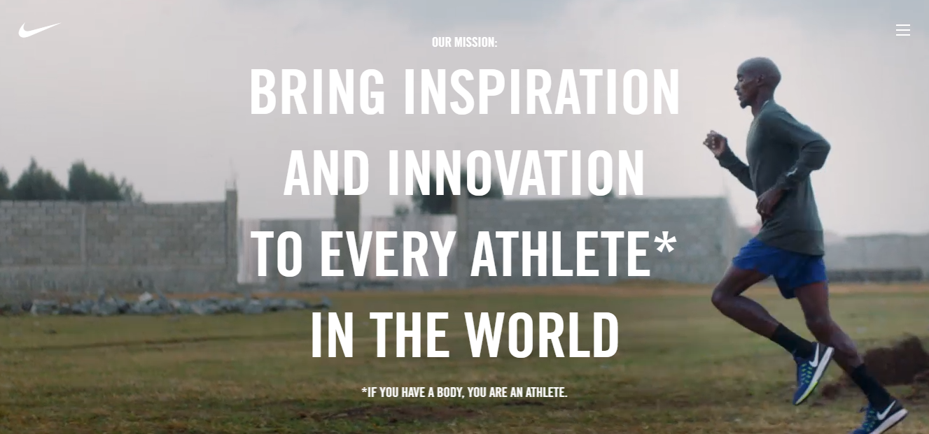
McDonald’s does it with fries, Starbucks does it with mermaids, and Nike does it with a swoosh. Logos are a way for brands to mark their territory, to tag their content, and their products. Your logo should:
- Capture the brand name and message
- Use colors that represent the desired emotion
- Think about placement across different materials
- Keep it clean and simple
- Represent your brand accurately
![]() Exercise: A good way to come up with a logo idea is to think about the keywords that best represent the brand, together with the feeling you want to inspire in people.
Exercise: A good way to come up with a logo idea is to think about the keywords that best represent the brand, together with the feeling you want to inspire in people.
Make a list of 50 keywords connected to the brand, sketch out a few ideas based on them, see what seems to work the best, and finally work on designing the final version based on that.
3. Fonts and Typography
Something that might not be obvious right away is using typography and fonts to express brand identity. There are tons of different fonts out there, and to spice up the boring text for your brand copy is a sure way to improve the visual quality.
Some brands, like Facebook, do not have a logo at all, and instead, they rely highly on typography to express their visual identity. Another famous example is the Coca Cola typography, which can be immediately recognized by people across the world.
Information Architecture
Our brains are trained to process, categorize, and understand a lot of visual information. The way that visuals and text elements are displayed, can have a significant impact on the consumers’ decision of whether they pay attention.

Different sizes, weight, and colors can guide the eye of the consumer to the most important places first. Use special fonts to give accent to the different areas and categories of information in your text for better navigation.
Very often, if something doesn’t look organized, people will simply ignore it and they won’t continue to read.

Always say the right thing, with the help of Grammarly. It helps us write articles for The Digital Brand Blueprint.
4. Visual Language
Digital content has evolved to make it easier for the consumer to understand information by representing as much of it as possible, with the help of visual elements instead of plain text.

There are many ways that a brand can visually express its identity, purpose, and intent. The visual elements can include icons, data presentations, photos, videos, motion graphics, and so on.
Example: Google often uses images and text highlights to make statistics more appealing and easier to memorize.

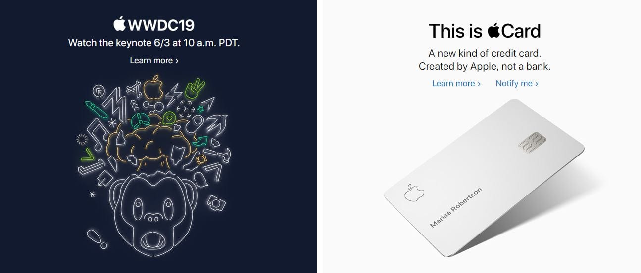
Example 2: Here apple uses emojis and symbols to explain the topics of their keynote and the emotion they want the audience to feel.
Example 3: Here LinkedIn posted a series of meaningful photos that have the same hashtag, recognizing dads that work but still make time for their kids.

The way that your brand presents information for the consumers should be consistent with the brand style as well.
5. Original Style
Putting it all together, the logo, the colors, and all other visual elements should come together and form a style that is unique to your brand. Of course, that can mean a lot of different things.
There are brands that draw inspiration from others, or brands that must look a certain way in order to fit in with the industry but adding a personal touch can set your brand apart.
While completely copying other brands or having a “cookie-cutter” style can make it hard for a business to stand out from the crowd.
Brand Style Guidelines
- Appropriate to its respective industry
- Captures the brand values
- Elements organized with a hierarchy
- Unique look and feel
- High-quality visual elements
Tip: Find a way to capture the personality of your brand and transfer it into the content and products that you produce. Create a mood board with pictures that represent the feeling that you want to give to people. Use the mood board as a style guide for your brand.

Elementor helps us express our style. You can also use it for free!
6. Assets library
You will have more and more branded content as time goes by, so it will become harder to stay organized. That is why you should consider creating an easily accessible visual assets library with all your visual aid at one place.
This is extremely helpful if you have a team of people that are responsible for creating visual content or you have partners and collaborators that need those materials as well.
The benefits of an asset library when you’re creating content:
- Easy access
- Organized content
- Up to date assets
It is smart to host the assets in a cloud, where multiple people can reach it, or keep it updated. That way, you will lower the time spent on creating and editing visuals, significantly.
We use Canva to create, edit, and keep track of our source files, along with an updated cloud library.
7. Visual consistency
In the digital space, your brand might be present on many different webs and social media platforms. That means that the visual identity should always be consistent and recognizable across all channels.

Make sure that your profile pictures have your logo to be easily recognizable. Always have a bio that gets the main points of your brand across.
That doesn’t mean that you should always use the same copy as well. Different social media platforms might require you to present your content in different ways, but always try to stay consistent with the style of your brand.
Take Oreo’s social media profiles as an example. They all have different bio copies, but the message is consistent across all of them. It is the profile of the worlds’ favorite cookie.
How to Build a Visual Identity of a Brand (Checklist)
- Choose the right colors that inspire emotion
- Design a logo that represents the brand value
- Use custom typography and fonts
- Use visual elements to communicate the brand purpose
- Bring it all together with a unique style
- Create a visual asset library with all your elements
- Stay consistent across all channels
If you need some more help with creating visual content for your brand, make sure you check out our list of 25 free content tools that will help you organize, create and market your content.
What to do next?
The visual identity of your brand is an important element of building a brand. If you need more help with getting your digital project up and running, we’ve prepared a free PDF guide on how to build and launch a brand in five steps.

Share this with your friends?